
Cómo hacer
What each figure on the Home dashboard measures
The Home dashboard is the first screen you see when you log in to Nevent, and it sums up your business in four blocks. Each one measures something different and, above all, covers a different period. This guide tells you exactly what each figure counts so you don’t compare apples with oranges.
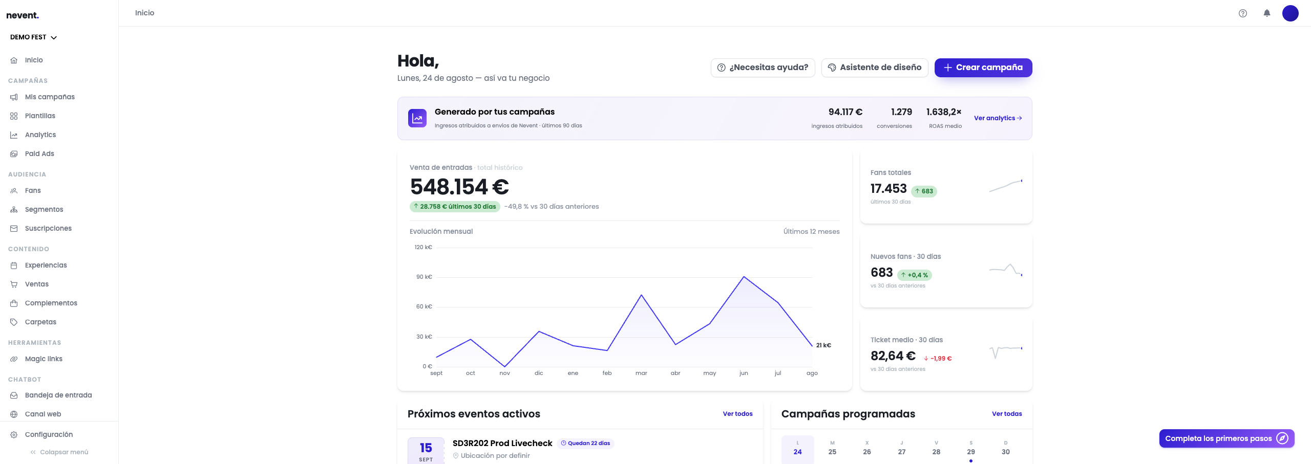
Step 1: Read the ticket sales headline
Section titled “Step 1: Read the ticket sales headline”The large card on the left is the most important one and the most often misread. Look at the label next to the title: Ticket sales · all-time total.
That means the big figure is not for this month or this year: it is everything you have sold since your account has been on Nevent.
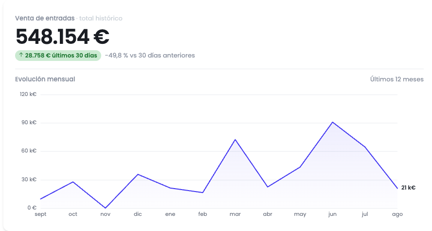
Below the amount there are two figures that are recent:
- The green tag with what you sold in the last 30 days.
- The change percentage against the previous 30 days.
Further down, separated by a rule, sits the Monthly evolution chart with its own time label: Last 12 months. It is a different period from the headline, which is why it has its own heading.
Three rules govern what goes into this figure:
| Rule | What it means |
|---|---|
| Ticket sales only | Cashless spending and purchases with no event attached are excluded. |
| Valid purchases only | Refunds and failed purchases do not count. |
| Always in euros | Sales in other currencies are converted at the European Central Bank rate for the day of purchase. |
Step 2: Interpret the three indicators on the right
Section titled “Step 2: Interpret the three indicators on the right”On the right there are three small cards. The first two are about your audience and the third about your sales.
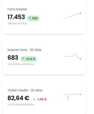
- Total fans: how many people you have in your base. Below it you see how many joined in the last 30 days.
- New fans · 30 days: sign-ups from the last month, with the change against the previous month.
- Average ticket · 30 days: the average amount per purchase over the last 30 days, with the difference in euros against the previous period.
Both fan cards count people, using the same definition as the Fans list. If you click either one, you land on that list and can check the figure yourself. The average ticket card takes you to the sales history.
Step 3: Tell attributed revenue apart from total sales
Section titled “Step 3: Tell attributed revenue apart from total sales”The top band, Generated by your campaigns, measures something entirely different from the headline: not what you have sold, but what Nevent can attribute to your sends.

Its subtitle states the time window: last 90 days, longer than the one used by the indicators on the right. It shows three figures: attributed revenue, number of conversions and average ROAS. The View analytics link takes you to the full detail.
This figure being much smaller than the ticket sales headline is expected: the headline covers all your sales, wherever they came from, while this one covers only those that can be tied to a specific campaign.
Step 4: Read the cashless block if you have it enabled
Section titled “Step 4: Read the cashless block if you have it enabled”If your organisation runs cashless, the dashboard adds a Cashless · food & drink block. It doesn’t appear when there are no cashless movements recorded.
Its subtitle, Recorded amounts · all editions, sets the scope: every recorded movement, with no date limit and without splitting by edition. It shows three figures:
| Figure | What it measures |
|---|---|
| Recorded consumption | What was spent at bars and food stalls. |
| Collected top-ups | The money collected when wallets were loaded. |
| Amount loaded | The balance that entered the wallet through top-ups, paid or unpaid. |
The three are different figures and don’t add up together: top-ups fund the wallet and consumption spends it, so adding them would count the same money more than once. The block itself warns about this. The amount loaded may also include balance loaded without payment, such as bonus balance.
When a figure is incomplete
Section titled “When a figure is incomplete”Each figure carries its own coverage mark, because one can be complete while another isn’t:
- Partial: the figure is real but leaves movements out. Below it, the panel says which ones — for example “Excludes 2 consumption records pending verification” or “Excludes 1 top-up with no paid amount reported.”
- Not available: there is no reliable amount to show.
When the only thing recorded is pending movements, the panel doesn’t present a zero as if it were the total: it shows what is recorded and warns that this is not the total.
If there are movements whose source data couldn’t be verified, a notice heads the block saying how many there are and that their amounts aren’t included in these figures.
Result
Section titled “Result”You can now read the blocks of the dashboard without confusing their periods:
| Block | Period |
|---|---|
| Ticket sales headline | All-time total |
| Evolution chart | Last 12 months |
| Fan and average ticket indicators | Last 30 days |
| Generated by your campaigns | Last 90 days |
| Cashless · food & drink | All recorded amounts |